What’s the first thing you think of when you hear ‘neutral’ in context of interior design? Bland? Boring? Lacking personality?
Over the years, color has become synonymous with bringing personality to your interiors. And while color is one way to express personal style, it’s not the only way. But the correlation between color and style has grown so strong, people have started to believe the opposite is also true: that designs lacking color also lack visual appeal.
This is a huge injustice to neutral interiors, so we’re here to set the record straight! We’ve rounded up some of our favorite neutral room designs to demonstrate, once and for all, that neutral hues and dynamic style go hand in hand.
Good interior design is less concerned with specific color and more with a blend of detail and dimension. Incorporating texture into neutral rooms is a great way of bringing visual interest to a simple color palette.
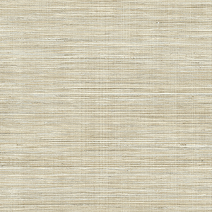
This powder room, for example, is the epitome of polished design. The woven details in the faux grasscloth wallpaper elevates the blend of beige and grey hues for a soft yet dynamic look. Combined with simple black accents and a hint of color in the soft blue-grey cabinetry, you have a very modern yet timeless space.
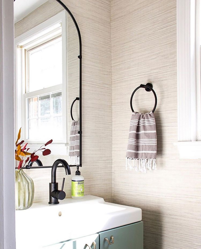
Baja Beige Faux Grasscloth Wallpaper
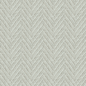
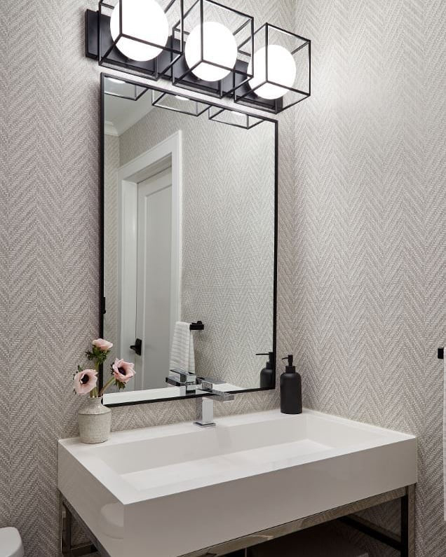
While this powder room is wrapped in a single silvery grey, it’s just as dimensional as the previous space thanks to a sophisticated woven chevron pattern. Paired with sleek black and white fixtures, the overall space has simple and elegant appeal.
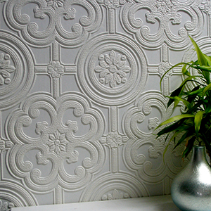
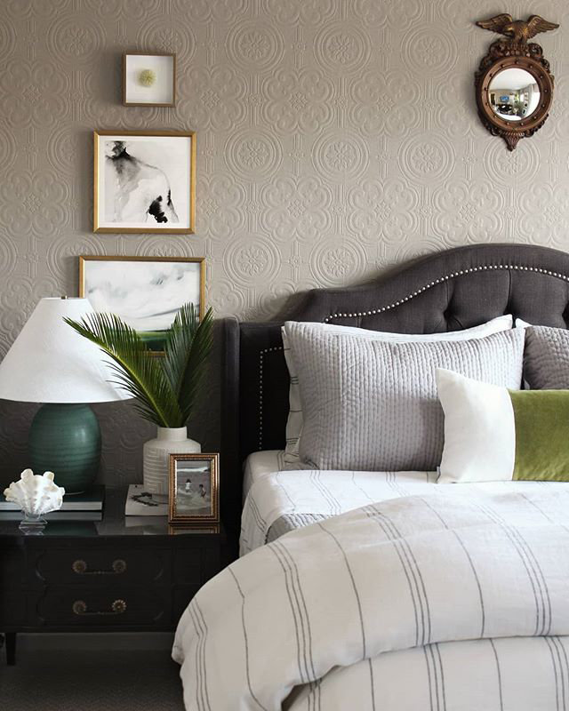
When it comes to dynamic neutral rooms, paintable wallpaper is a fantastic way to add dimension to more muted hues. With paintable wallpaper, you get the benefit of both beautiful design and texture from the wallpaper’s raised detailing.
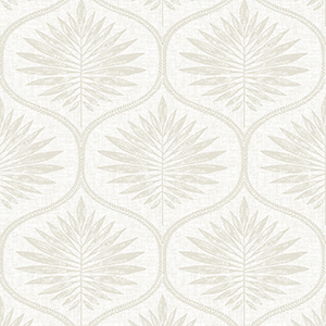
Take this stunning guest bedroom. Once a standard cookie-cutter space, the room is now a blend of old-world charm and modern furnishing. The architectural floral detailing of the paintable wallpaper creates a simple yet compelling backdrop for the bed. The depth it brings to this predominantly grey room elevates the entire space and provides a sophistication color alone – neutral or otherwise – could not.
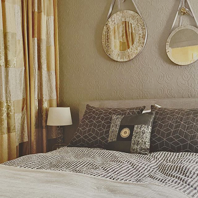
The same can be said for this bedroom as well! In this space, the wallpaper features a regal and large-scale floral damask that brings character to the taupe paint. This colored backdrop serves as a bridge between the dark charcoal bedding and the bright golden details in the curtains. Combined, all the textural layers create a warm and inviting retreat.
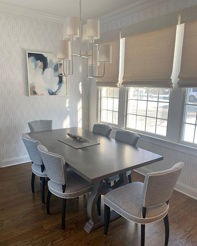
Subtle graphic details also go a long way in bringing neutral hues to life. Take for instance this simple and stunning formal dining area. Outside a splash of blue in the painting, the room is all neutral hues – yet it’s filled with delicate dimension. This is largely due to the blend of fabrics, natural textures, and wallpaper detailed with undulating dashes of silver-grey.
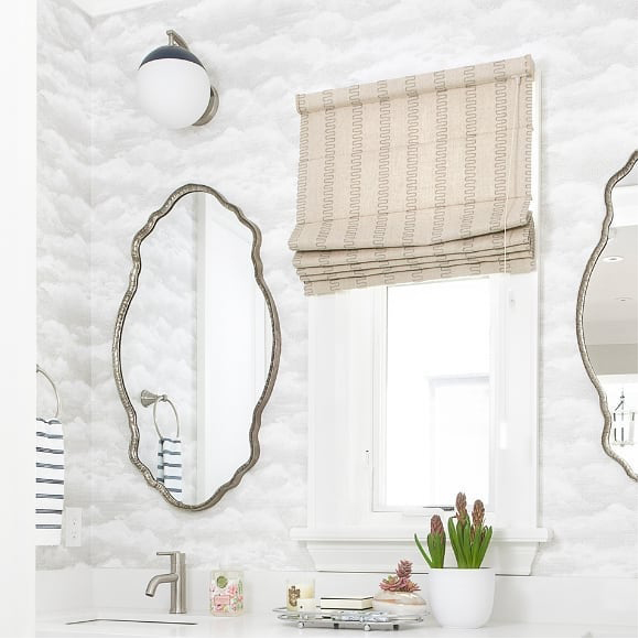
For more playful neutral design, try a more whimsical graphic like the cloud wallpaper in this bathroom. The pillowy, free-flowing shape of the silvery-white clouds are echoed in the curved mirrors for a sophisticated and airy look. The silver accents throughout, along with the wave detailing in the window treatment, continues this light, breezy and sophisticated vibe.
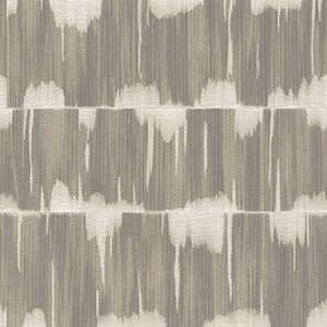
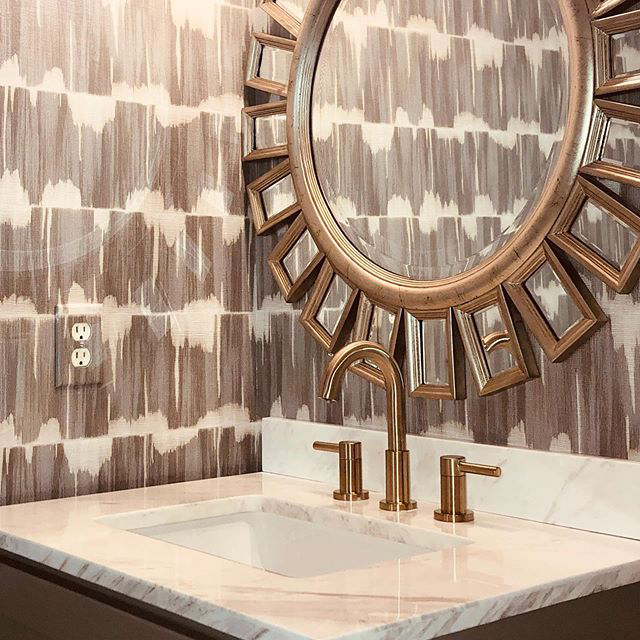
For bolder neutral style, look for dynamic geometric designs. The distressed, wavelength stripes of this golden taupe pattern brings excitement and motion to the space. The golden fixtures and elaborate mirror amplifies the wallpaper’s bright tones, while the white marble countertop pulls out the creamy accents in the wallpaper.
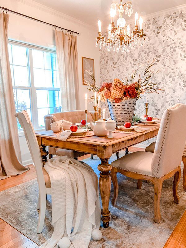
Botanical designs have universal appeal, and the natural details are a perfect pairing for neutral room designs. For example, this elegant and understated dining room and its grey leaf feature wall. The airy watercolors and overlapping sprigs give the room a breezy sense of movement. Paired with the rustic wooden details, layers of fabric textures and sophisticated finishes, the room is transformed into a comfortable yet upscale space.
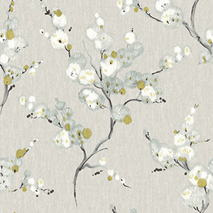
While the satiny grey alone in this bathroom would give it a luxurious feel, the floral blossoms have a much more glamorous effect. The white blooms bring dimension to the white fixtures throughout the space, while the subtle chartreuse of the leaves embellish the golden accents.

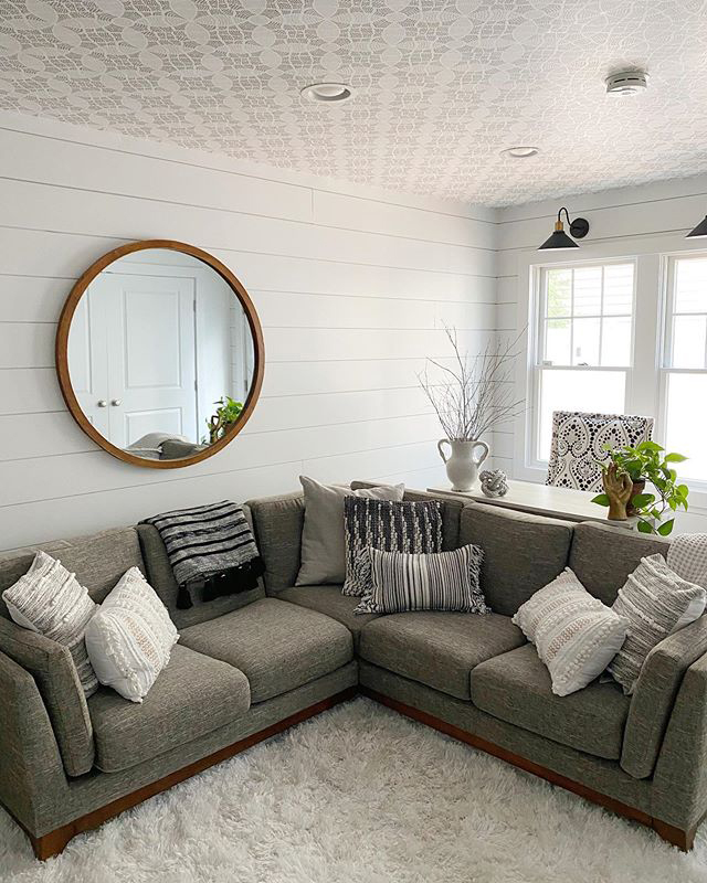
Delightfully unexpected details really amp up the wow-factor of neutral room design – or ANY interior design, really. This year, we’ve seen a steady rise in wallpapered ceilings and we’re for it! Ceilings have highly untapped design potential, and the extra attention to this surface can transform the feel of your entire space.
This bright and inviting living room is a great example of this. Below the ceiling, the space has a very modern but basic farmhouse vibe. The broad white shiplap frames the space while a variety of grey fabrics and textures add a sense of coziness. However, the room becomes truly special with the addition of the ceiling’s intricate geometric design which unites and elevates the room’s simple furnishings with its subtle sophistication.
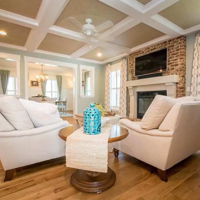
Simple textural accents can be equally as impactful as detailed, graphical wallpaper. For example, the light brown wallpaper with fabric-like detailing used on this sitting room’s ceiling. While a simple selection, the contrast in color and texture with the white wooden beams infuses the space with thoughtful and classic elegance.
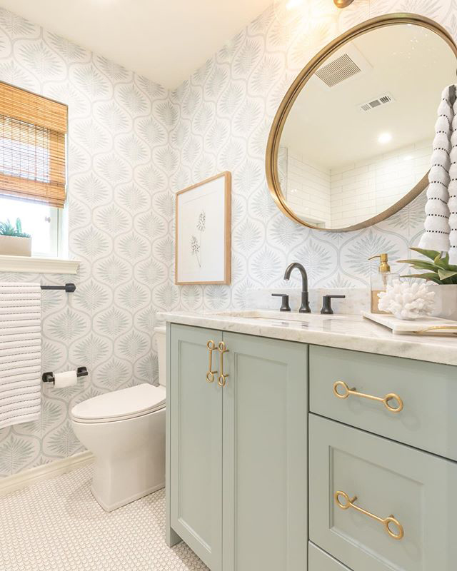
Contrary to popular belief, it’s not just earth tones and greys that can be used as neutral tones! Soft pinks, subtle blues, and dusty greens – a particularly popular choice this year – can also be used as a base in neutral room designs. The results are soft, subtle, and truly spectacular.
Take this absolutely gorgeous bathroom. The delicate shade of sage green on the shaker cabinets blends perfectly with the warm taupe of the botanical wallpaper and the mix of black, gold, and natural wood accents throughout.
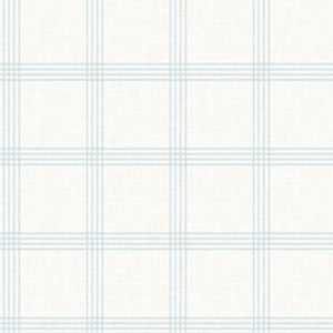
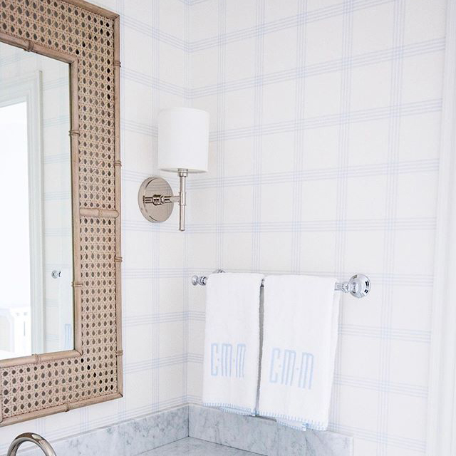
The same can be said for the clean and classic bathroom design. While the pinstriping in the simplified plaid wallpaper is a delicate and dusty blue, it perfectly compliments the grey tones of the vanity and the silver fixtures.
In conclusion: neutral is NOT synonymous with boring and personality-less interiors! Neutral rooms can be just as personality-packed as vibrantly colored spaces, because it’s not the color that matters: it’s the layers of dimension and detail to you bring to the space.

A design enthusiast thrilled to be decorating her first & forever home, Jen covers all things interiors with a special emphasis on strategies for developing beautifully simple and simply beautiful style. When not mentally curating her dream home, she can be found honing her submissions skills in Brazilian Jiu-Jitsu and Krav Maga.
